Introduction
The CalendarDatePicker acts like the regular DatePicker from Windows 8.1 but with a design of a calendar month. The default styles fits directly in with other control default styles and supports both light and dark theme and of course the platforms Windows and Windows Phone.
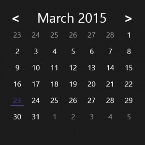
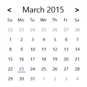
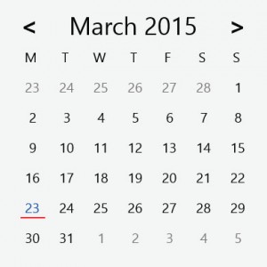
Here is a few images to give you an idea of what the control looks like.
In this post, I will explain how to use the control and its features. The source code for this control is of course available you will find a link at the bottom of this post.
Properties
The CalendarDatePicker inherits from ItemsControl beside the properties from the ItemsControl I have added some additional ones.
SelectedDate
The date selected on the CalendarDatePicker. Does of course support two-way bindings so it will change the date should it change on the data bound item. This value updates immediately when a user clicks a date. The default value is DateTime.Now.
<controls:CalendarDatePicker
    SelectedDate="{Binding SelectedDate, Mode=TwoWay}" />
FirstDayOfWeek
The first day of the week. Supporting only Sunday and Monday would properly be sufficient however, the control supports all days. The default value depends on the value set in the current culture info but can be set manually or even bound.
<controls:CalendarDatePicker
    FirstDayOfWeek="Monday" />
WeekDaysCharLenght
The number of characters shown in weekdays and supports the values 1-3.
1: will show Mondays as M. 2: Mo and 3: Mon.
Note that the base style does not support 3. There is no room for a third character therefor the control will be cropping some of the text. If you want a third character you will have to restyle the control otherwise stick with the values 1 and 2. The default value is 2.
<controls:CalendarDatePicker
    WeekDaysCharLenght="1" />
DisplayWeekDays
Whether or not weekdays should be shown above the actual dates. Since WeekDaysCharLenght does not support the value 0 this is the way to hide it. The default value is true.
<controls:CalendarDatePicker
    DisplayWeekDays="False" />
CalendarDatePicker
The demo project contains the source code for the CalendarDatePicker and an example of custom styling.
When creating custom styles for the CalenderDatePicker there a few things worth noting.
The CalendarDatePicker is a modified ItemsControl. It is very depended on the panel placing its items. By default, it is a WrapGrid with max columns of 7. You should properly not change this.
The CalendarDatePickerItem is the selectable dates. It contains visual states to control its appearance. This is based on a radio button. So use the checked states to style the date when selected. I have created some additional state. IsToday/NotToday for highlighting todays date which is based on DateTime.Now. IsInCurrentMonth/ NotInCurrentMonth to style when a date is within the current displayed month.
The CalendarDatePickerWeekDayItem is the weekdays. This is based on a Control with a WeekDay string witch is set by the CalendarDatePicker class. Both CalendarDatePickerItem and CalendarDatePickerWeekDayItem are items within the items control.
If you have, any questions regarding this feel free to leave a comment.
You can download the demo project here.
Η µέγιστη συνιστώµενη συχνότητα λήψης του φαρµάκου είναι µία φορά την ηµέρα, dikofarmakeio ωστόσο, η συνεχής καθηµερινή λήψη του cialis σε δόση των 1 ή 1mg δεν συνιστάται. Το levitra είναι φάρμακο που συμβάλλει στη βελτίωση της λειτουργίας της στύσης.
P.S Make sure you follow me on twitter @danielvistisen for updates on new posts.