Validate using attributes in MVVM

Introduction

The goal here is to create an easy way to add validation to properties when working with xaml and MVVM.

I have chosen this approach:


[ValidateMethod("ValidateFirstName")]
public string FirstName
{
    get { return firstName; }
    set { SetProperty(ref firstName, value); }
}

public string ValidateFirstName()
{
    if (string.IsNullOrEmpty(FirstName))
    {
        return "First name is mandatory";
    }

    return string.Empty;
}

Simple attribute referring to a method by string. The method then handles the validation.
The reason for choosing attributes is to make validation on properties easy to spot for all developers reading the code.
Continue reading “Validate using attributes in MVVM”

P.S Make sure you follow me on twitter @danielvistisen for updates on new posts.

Validate using attributes in MVVM

CalendarDatePicker control for Universal apps

Introduction

The CalendarDatePicker acts like the regular DatePicker from Windows 8.1 but with a design of a calendar month. The default styles fits directly in with other control default styles and supports both light and dark theme and of course the platforms Windows and Windows Phone.

Here is a few images to give you an idea of what the control looks like.

CalendarDatePicker Dark Theme   CalendarDatePicker Light Theme   CalendarDatePickerCustomStyle

In this post, I will explain how to use the control and its features. The source code for this control is of course available you will find a link at the bottom of this post.

Continue reading “CalendarDatePicker control for Universal apps”

P.S Make sure you follow me on twitter @danielvistisen for updates on new posts.

CalendarDatePicker control for Universal apps

Simple WrapPanel

Introduction

Windows Store and Windows Phone apps does not have a WrapPanel. The closest we get to this is the WrapGrid. In this post, I will show how to create a simple WrapPanel with an Orientation property. The panel reusable for all xaml based application. I will also explain Measure and Arrange witch is the basic mechanism for making the panel work.

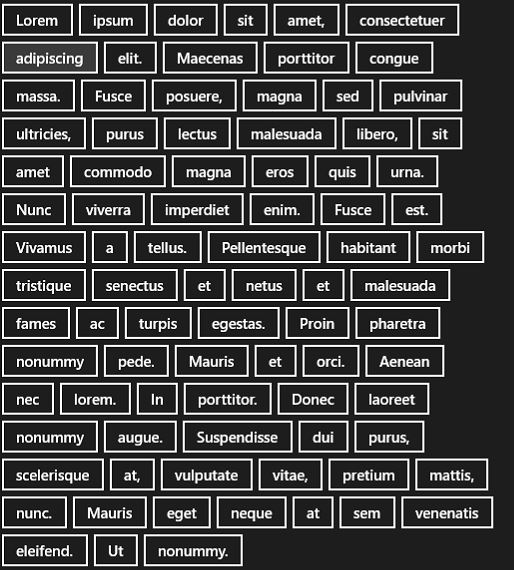
The WrapPanel should position child elements from left to right, breaking content to the next line when at the edge of the panel. Positioning from right to left or from top to bottom depending on the value of the Orientation property as shown on the image below.

WrapPanel image
WrapPanel with ipsum content buttons.

Continue reading “Simple WrapPanel”

P.S Make sure you follow me on twitter @danielvistisen for updates on new posts.

Simple WrapPanel

Supporting INotifyDataErrorInfo in Universal apps

Introduktion

Windows Store app (WinRT-XAML) does not have validation build inside bindings. However, that does not mean it is not possible to get validation by a similar approach.

In this post, I am going to show how to add validation to a control and use the binding for validating.

With validation enabled on the control, it should look similar to this.

<TextBox
    Header="First name"
    Text="{Binding FirstName, Mode=TwoWay}"
    Style="{StaticResource TextBoxStyle}" />

Continue reading “Supporting INotifyDataErrorInfo in Universal apps”

P.S Make sure you follow me on twitter @danielvistisen for updates on new posts.
Supporting INotifyDataErrorInfo in Universal apps

Supporting INotifyDataErrorInfo in Windows Phone 8.1 Silverlight

Introduction

In this post, I am going to show how to add validation to Windows Phone. As I mentioned in a previous post Windows Phone supports INotifyDataErrorInfo to some degree. The goal here is to add a red border to a Textbox when its text is invalid. Note that this approach is useful for all controls not only textboxes.

Continue reading “Supporting INotifyDataErrorInfo in Windows Phone 8.1 Silverlight”

P.S Make sure you follow me on twitter @danielvistisen for updates on new posts.

Supporting INotifyDataErrorInfo in Windows Phone 8.1 Silverlight